Visualizations for UBM
The graphical visualization for the UBM is present in the User Behavior Mining tab in the Insight tab.
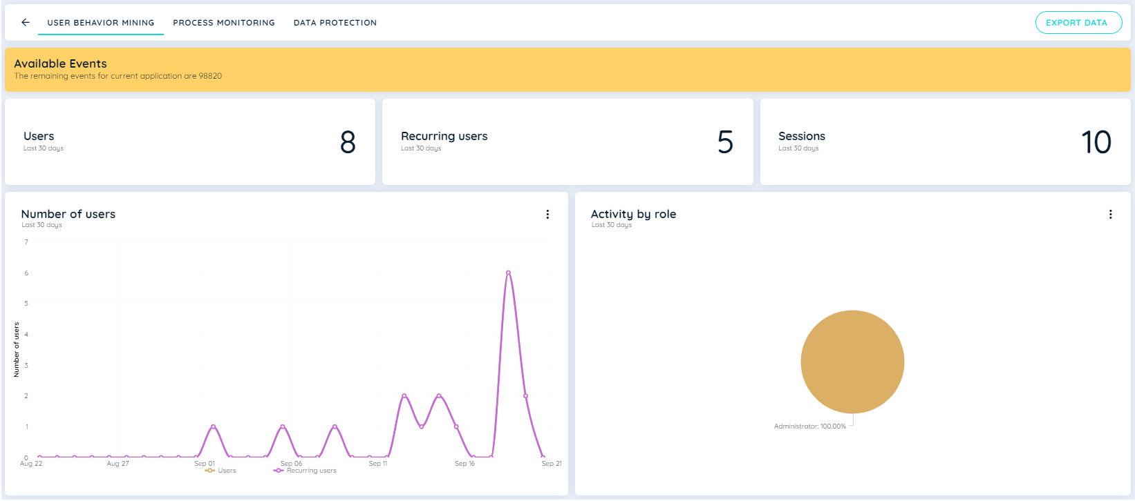
The graphical representation consists of the number of users, the number of recurring users, the sessions carried out by users, the country bubble chart, the activity by role chart, and the activity by area.
Number of Users Chart
This Line chart represents the number of users that appeared on the application. The Y-axis displays the total number of users, and the X-axis displays the dates on which the user has made interactions. This cart shows data for the last 30 days and for all time.
This line chart also illustrates the count of recurring users within the application. The Y-axis depicts the cumulative number of recurring users, while the X-axis indicates the dates corresponding to user interactions. This chart presents data for both the last 30 days and reading for All time.
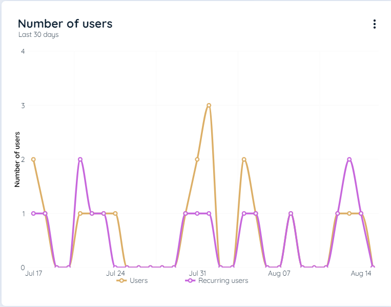
Number of Users Chart
Activity by Role Chart
This chart displays the division of all users who made interactions by using any role using the Pie chart and the percentage of users in those roles with their respective role names. This cart shows data for the last 30 days and for all time.
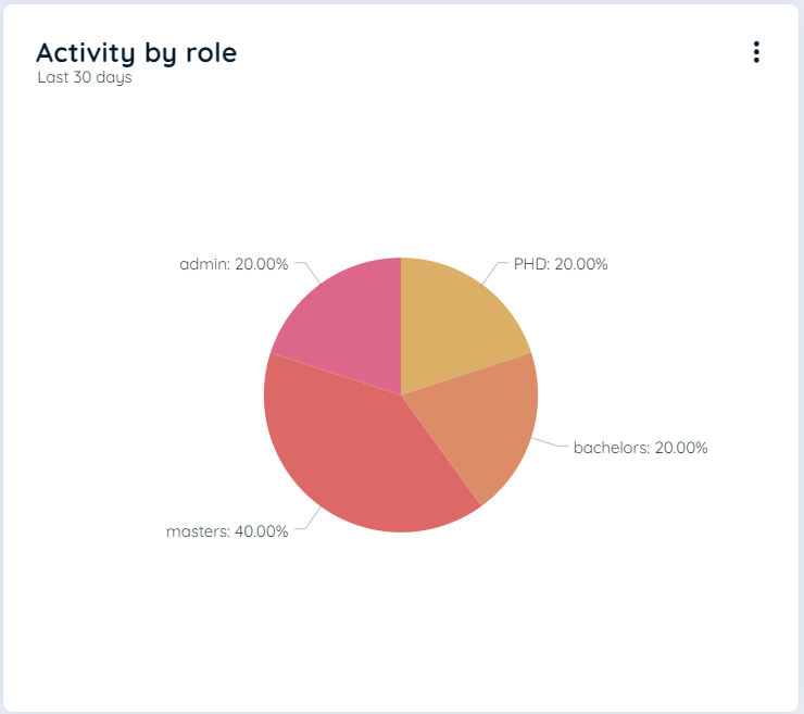
Activity by Role Chart
Activity by Country Chart
Country bubble charts are an innovative and captivating way to visualize data on a geographical map. This interactive chart type combines the power of mapping with bubbles to create a dynamic and engaging representation of information.
By plotting data points as bubbles on a map, you can effectively convey complex data patterns, trends, and relationships. Each bubble represents a specific data point or value, and its size, color, or other visual properties can be mapped to different data attributes, making it easier to understand and interpret the information. Each bubble displays a country and the number of users from that country. This chart shows data for the last 30 days and for all time.
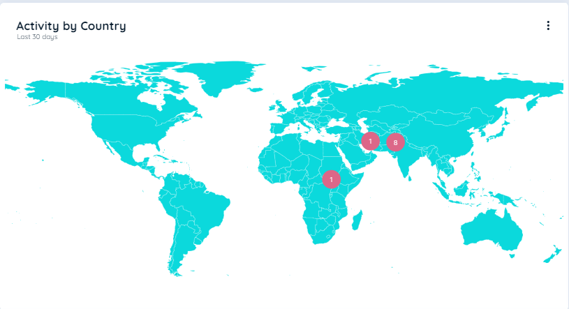
Country Bubbles Chart
Area Nested Pie Chart
An area-nested pie chart is a type of data visualization that allows you to represent hierarchical data in a visually appealing and informative manner. This chart uses nested circles to depict the hierarchical structure of the data, with each circle representing a different level or category.
The key characteristic of an area-nested pie chart is that the size of the circles varies based on the proportion of data they represent. The radius of each circle is determined by the magnitude or weight of the data it represents, allowing for a more accurate representation of the hierarchical relationships and the distribution of values within each category. This chart shows the data for all the trackable elements that are mapped by the Area Label using any JSON defined by users or by Auto Tracking. Users that make interactions in that area of the trackable elements are recorded in this chart. This chart shows data for the last 30 days and for all time.
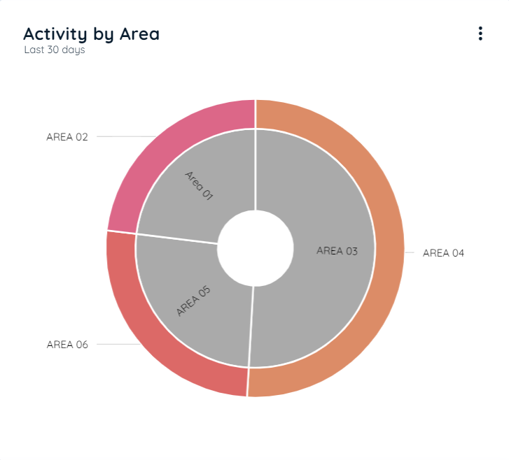
Activity By Area Chart
The terms "inner data" and "outer data" refer to the data values associated with the inner and outer circles of the chart, respectively.
The inner data represents the values or proportions within the innermost circle of the nested pie chart.
On the other hand, the outer data represents the values or proportions within the outer circles of the nested pie chart.
By visualizing the inner and outer data together, a nested pie chart provides a comprehensive representation of the hierarchical structure and the distribution of values across different levels or categories. It enables viewers to understand the relative proportions at each level and the overall composition of the data.
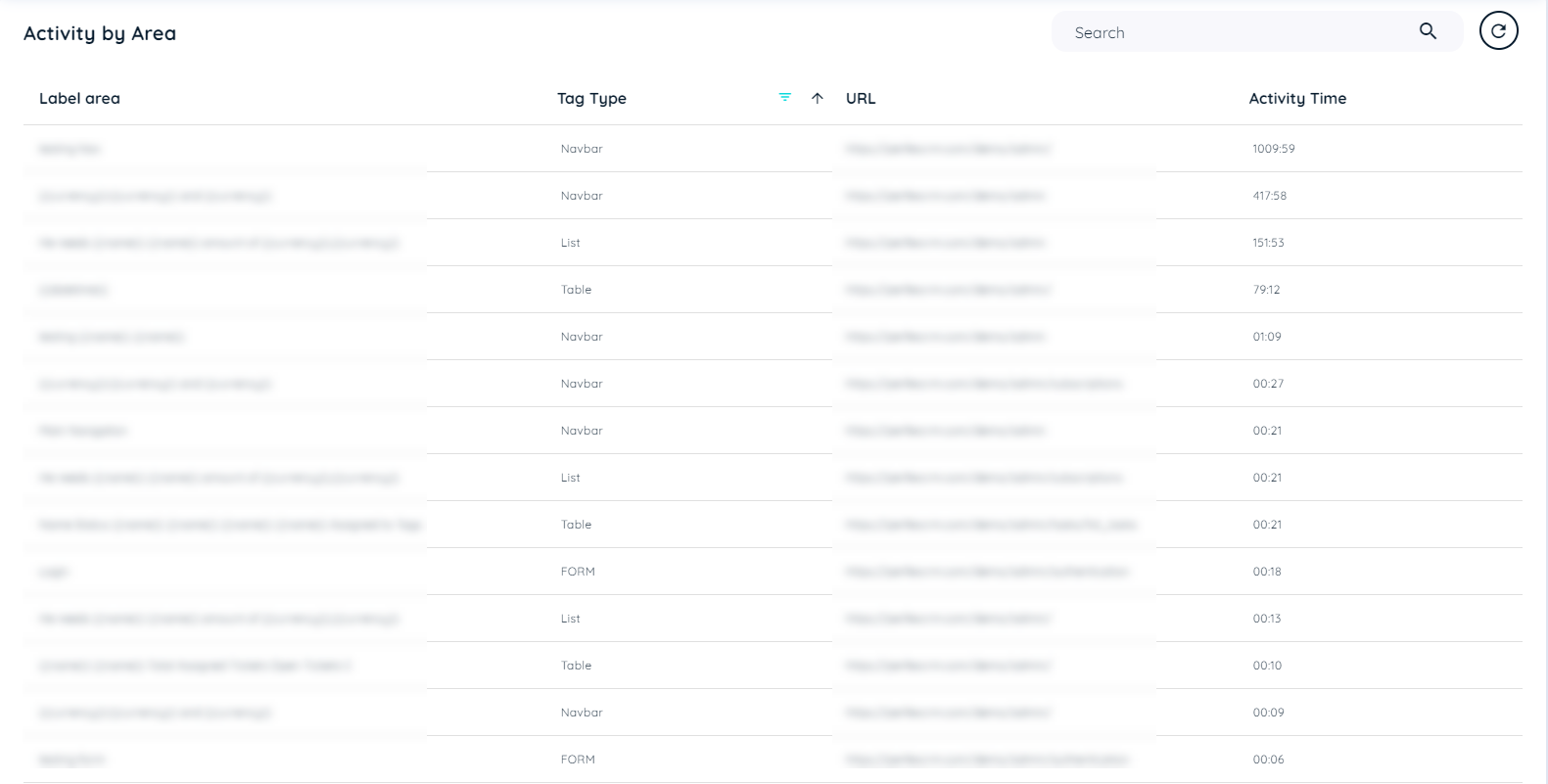
Activity By Area Table
Activity by Area: The table shows all the areas that the user has clicked while UBM is active. The table includes the following detailed information about Trackable Area.
- Label Area: Represents the extracted text from the area.
- Tag Type: Indicates the type of interaction with the trackable area.
- URL : Indicated a link where interactions are made.
- Activity Time: Denotes the duration of user engagement within that particular area.
- Tag Type Filter: A drop down is available in the tag type list to narrow down the search according to any tag type recorded in the table.
Activity by Area Table
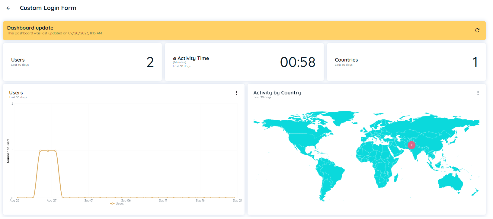
Detail Analytics of Activity by Area
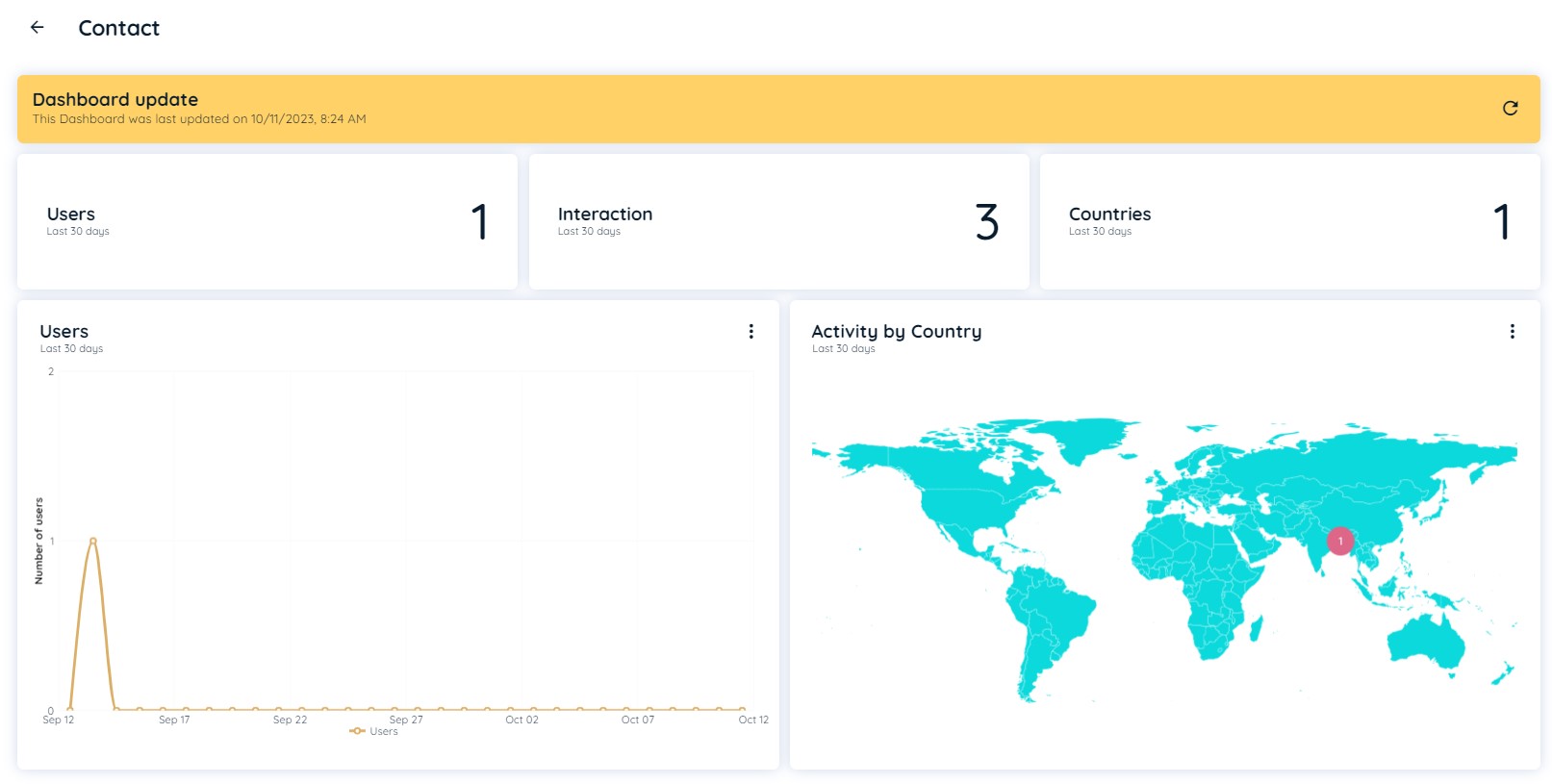
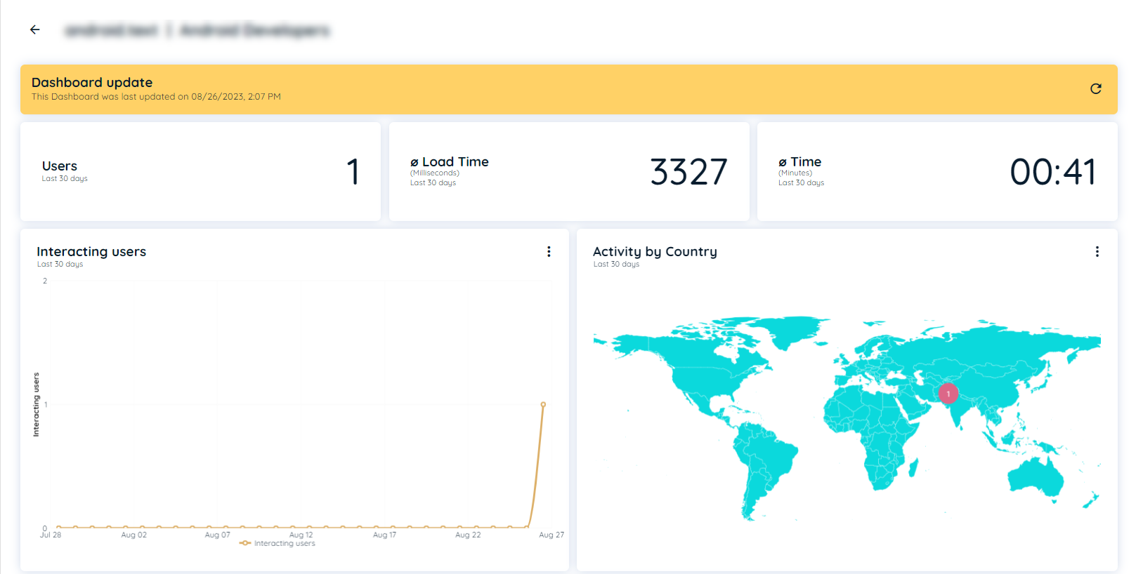
If a user clicks an entry in new UBM area form, then an detailed analytics dashboard should slide in. This page will display detail analytics for Activity by Area with different insights. There is a refresh button that fetch data manually and display the updated data of the page. This page contain 3 header tiles
- Users: This will show count of all users that has clicked specified element.
- Countries: This will show that in which countries that element is being clicked
- Avg. Activity time: This will show average activity time that has used for that element in minutes and seconds.
Below this it has two charts
- Users: This line chart shows number of users for each day and month with selection of last 30 days or All-time that has clicked specified element within that area.
- Country: This chart shows number of users per country specifically for that link with selection of last 30 days or All-time from which that specified element is being clicked within that area.
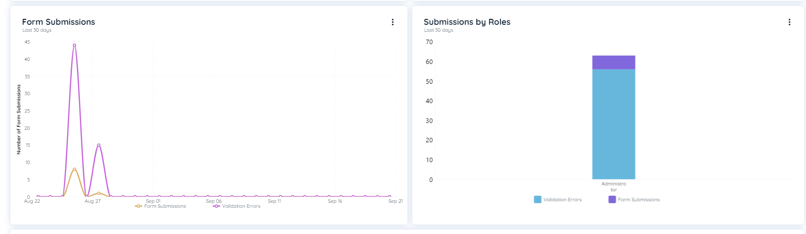
In case its a form two additional charts will also displayed
- Form Submissions: This line chart shows how often its submitted and whenever validation errors occur.
It shows separate lines, one for Form Submissions and other for Validation Errors. - Submissions by Role This Stacked bar chart shows the roles that have submitted the form and how often along with the number of errors per role.
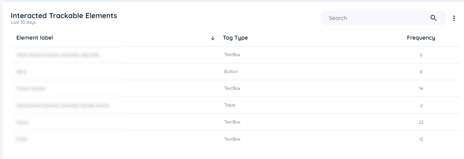
Below these charts, there is table "Interacted Trackable Elements"
This table shows details of all Elements Label along with it's tag type and frequency that are clicked within that area.
It shows Element Label, tag type and frequency ( no. of clicks per element)
with selection of last 30 days or All-time.
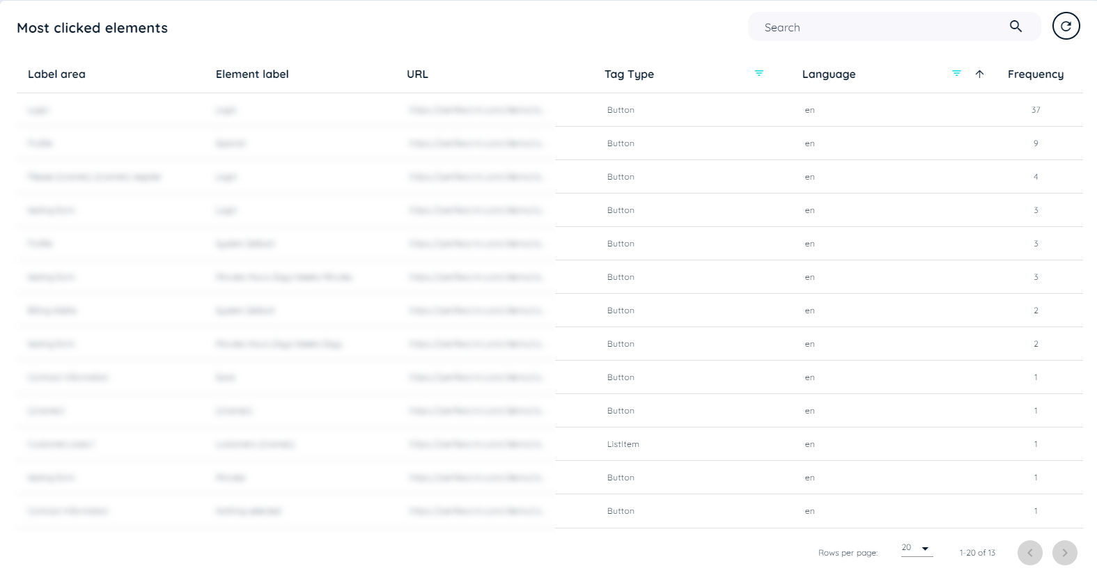
Most Clicked Elements
Most clicked element tables show all the elements that the user has clicked while UBM is active. The table includes the following detailed information about TrackableArea and TrackableElement:
- Area Title: It is a trackable area title
- Label Area: Refers to the area's extracted text
- Element Label: Refers to the extract element label text
- URL: Application on client side URL
- Tag Type: Type of click on trackable element
- Language: Language of the browser
- Frequency: Count of clicks on a trackable element
- Tag Type Filter: A drop down is available in the tag type list to narrow down the search according to any tag type recorded in the table.
- Language Filter: A drop down is available in the tag type list to narrow down the search according to any language recorded in the table.
Most Clicked Elements Table
Detail Analytics of Most Clicked Elements
This page will display detail analytics for most visited pages with different insights. There is a refresh button that fetch data manually and display the updated data of the page. This page contain 3 header tiles
- Users: This will show count of all users that has done interaction.
- Interaction This will show total number of interaction with the element.
- Country This will show total number of countries that element is being clicked on.
Below this it has two charts
- Users: This line chart shows number of users for each day and month with selection of last 30 days or All-time.
- Country: This chart shows number of users per country with selection of last 30 days or All-time.
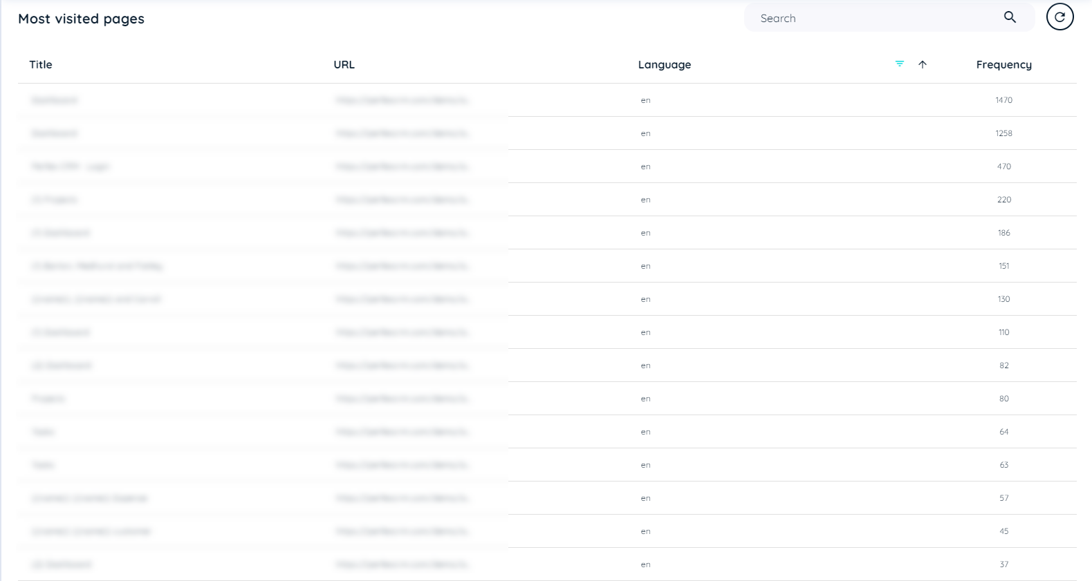
Most Visited Pages
Most visited pages show all the URLs of pages that the user has visited frequently. The table includes the following details about the pages:
- Title: Application Title of the client side
- URL: Application URL on which avatar is present
- Language: Language of the browser
- Frequency: Count of visits to that URL
- Language Filter: A drop down is available in the tag type list to narrow down the search according to any language recorded in the table.
Most Visited Pages
Detail Analytics of Most Visited Pages
This page will display detail analytics for most visited pages with different insights. There is a refresh button that fetch data manually and display the updated data of the page. This page contain 3 header tiles
- Users: This will show count of all users that has done interaction on specified link.
- Avg. Load time: This will show average load time for that specific link in milliseconds.
- Avg. Activity time: This will show average activity time that has used for that link in minutes and seconds.
Below this it has two charts
- Users: This line chart shows number of users for each day and month with selection of last 30 days or All-time.
- Country: This chart shows number of users per country specifically for that link with selection of last 30 days or All-time.
Detail Analytics of Most visited pages
Below these charts, there is table "Elements of area"
This table shows most visited page records in detail table view.
It shows Label area, element label, Tag type, Language and frequency ( no. of clicks per link)
with selection of last 30 days or All-time.
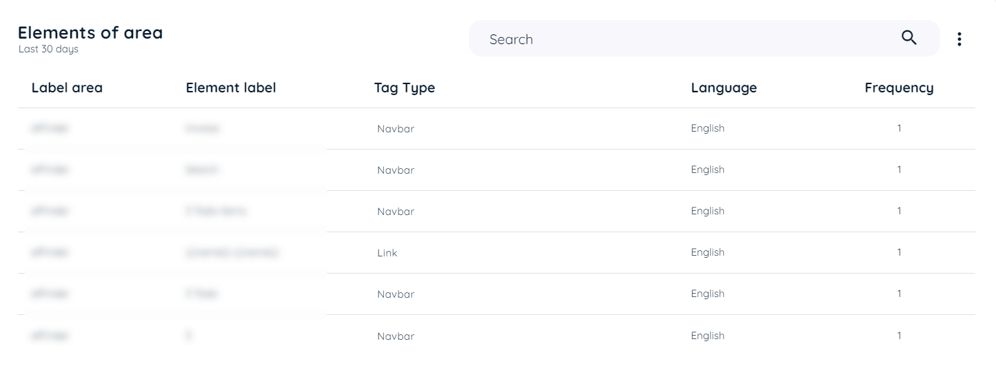
Elements of Area
Updated about 1 month ago